


My brain works in a weird way - I associate words and sounds with colours. Up until recently, I thought everyone had that. Turns out, I just have synesthesia. A condition, in which stimulation of one sensory or cognitive pathway leads to involuntary experiences in a second sensory or cognitive pathway.
Not everyone is like me. Some people can’t exactly hear or smell colours. Nonetheless, it doesn’t mean that colours don’t have a big impact on people’s lives. In fact, 100% of purchasing decisions are influenced by colour in one way or another, and 85% of them are driven by colour alone.
Sounds like a great fact for marketers to leverage, doesn’t it? Say no more! An in-depth guide into using colour in email marketing is exactly what you need to improve your email marketing metrics.
Arise, fellow visual learners, you’re in for a treat! NetHunt has prepared some delicious eye-candy for you!
Why is colour important for email marketing?
Colour psychology is the study of how different colours affect buyer behaviour, whether they have any effect on their purchasing decisions, and the perception of the brand.
According to an Emerald study called "Impact of color on marketing," up to 90% of instant judgments made about products are based primarily on the colour associations.
On top of prodding up towards a purchasing decision (or pushing us away from it), a strategically placed colour is capable of the following:
- Boosting brand awareness. Using the right colours in your marketing activities can establish your brand in the minds of your email recipients, which leads to an 80% increase in brand recognition. [CampaignMonitor]
- Increasing sales. The choice of colours can prompt your customers to buy products.
- Increasing click rates.
The psychology of different colours
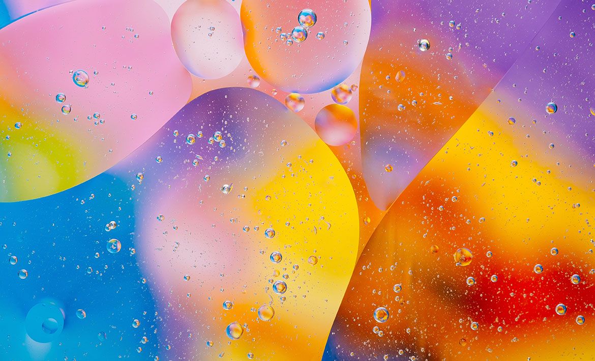
According to colour psychology, every colour, shade, and hue has different implications and effects on the mind of the person seeing it. While there are billions of different shades, they are merely a variation of one of seven core colours - black, white, red, orange, yellow, green, and blue. On the other hand, purple is an artificial colour. However, its importance in the world of email marketing is huge, so I’m going to cover the meaning behind it (and not because purple is my favourite colour!).
Black

Associated with: Intelligence, elegance and authority
Traditionally, black is the brand colour of grief and sorrow. It has a strong gothic touch to it, and it supposedly brings bad luck . The colour black definitely doesn’t have the brightest (pun intended) reputation. After all, both death and misery are usually portrayed in black shades. Or at least it used to be that way...
Did you know poor, black kitties are the least likely to get adopted because of their association with bad luck?
The world of marketing has taken a 180-degree turn with the colour black and ditched all its usual connotations. When it comes to marketing, especially digital marketing, black is the universal symbol of power, sleekness, elegance, and authority.
It has fashion houses and tech-companies to thank for this. Such drastic rebranding is the product of active use of black by various avant-garde companies marketing high-end, luxurious goods. Chanel, Yves Saint Laurent, and Apple all employ the colour black to add mystery to their brand image and spark interest in it.
A bright (again, pun intended) example of black in emails to spice them up and accentuate the prestige comes from Chanel. The company used black as the dominant colour of the email to draw a strong association with wealth and exclusivity of the brand. They did so with caution. You still need to be careful when playing with such a deep and overpowering colour. Add too much of it, and you can evoke the fear of the unknown in your email recipients - we are all guilty of fearing the dark.

? NetHunt Pro Tip: To avoid any negative emotions when using black in your email designs, make sure you add a pop of bright colour to the mix.
Purple
Associated with: Luxury and wisdom
Purple is traditionally a regal colour. Back in the old days, it was used for kings’ robes to showcase their superiority, power, and wealth. These connotations haven’t changed. Up to this day, purple is most commonly used as the on-brand colour for all things luxurious, elite, and unique.
On the other hand, lighter shades of purple are less tightly linked with nobility and are commonly used to accentuate delicacy and femininity.
Alongside the traditional connotations of sophistication, purple can also give off a mysterious, almost witchy vibe. Some shades of purple have spirituality implications. Often the brighter, bolder shades of purple are linked with creativity and innovation. In fact, a lot of companies who use purple as their brand colour take pride in their creative approach to business, taking advantage of it as a selling point.
All things considered you need to remember to not go overboard with purple. If overused, this colour can cause feelings of frustration, depression, and nostalgia. This is particularly relevant to darker shades of deep purple (get that smoke off the water!)
? NetHunt Pro Tip: Use rich purple shades in combination with gold or dark yellow to make an offer fit for a king or queen.
Blue

Associated with: Security and trustworthiness
The immediate associations with ‘blue’ are the sky and water. Both of them are the symbols of harmony, calm, and trust.
There’s nothing more majestic than blue skies or deep ocean waters; smart and secure. Nothing ever escapes them. Besides, blue often has a soothing effect, which fosters a sense of stability and credibility.
Blue is extremely popular among tech-companies, especially those related to data processing (hello, NetHunt CRM!) since it helps to create a sense of reliability and intelligence. So, whenever there’s a launch of yet another cutting-edge product, expect all shades of blue to dominate the announcement email.
However, not all companies benefit from blue. There’s evidence to suggest that the colour blue is an appetite suppressor. So if you’re a food company trying to tempt your customers to order more from you with a tasty email and you happen to add blue into your colour scheme.... Don’t. On top of that, just like anything else blue is good in moderation. You don’t want to overuse it and get your email recipient to start ‘feeling blue’.
? NetHunt Pro Tip: Use different shades of blue for stats and figures in your emails. That way, they’ll appear more trustworthy and memorable.
Green

Associated with: Calmness and peace
As you might’ve anticipated, the colour green is Mother Nature’s one and only. Humans are simple creatures; everything natural is automatically nice and peaceful in our minds.
Some of the most common connotations the colour green has are those of renewal, health, and life in general. However, there’s more to green than just being the ultimate eco-friendly choice. Green is a very dynamic colour with different shades of it signifying different moods and vibes.
For instance. Bright green is your go-to to symbolise new beginnings and active changes, while darker, deeper shades of green (think, emerald green) are there to mark growth and stability. Why? Dollar bills, of course. Modern society tends to place ‘economy’ into ‘eco-centric’.
Most commonly, all shades of green appear in the email campaigns from pharmaceutical, environmental, and organic foods companies.

? NetHunt Pro Tip: Green is rumoured to have antidepressant, calming effects. Include this colour when you’re dealing with a challenging situation via email. Pull a Jay Gatsby and criss-cross the light of hope with a promise of abundance and prosperity.
Yellow

Associated with: Optimism and creativity
Nothing screams ‘HAPPINESS’ louder than the colour yellow. As a kid, you would religiously use that bright yellow pencil to brighten up your drawing with a half-there, half-not circle in the top corner. It would bring you so much joy. Now you’re an adult, and unless you’re in the art industry, you probably don’t use coloured pencils anymore. But the association is still there.
You’re conditioned to experience extreme waves of positivity whenever you see the right shade of yellow, and marketers know about that. That’s why the colour yellow is often used to energise emails, bring warmth and enthusiasm to your response to the message.
Just make sure you don’t overdo yellows. Fly too close to the Sun and… You know what happens next. Besides, in excessive amounts, yellow can cause anxiety!
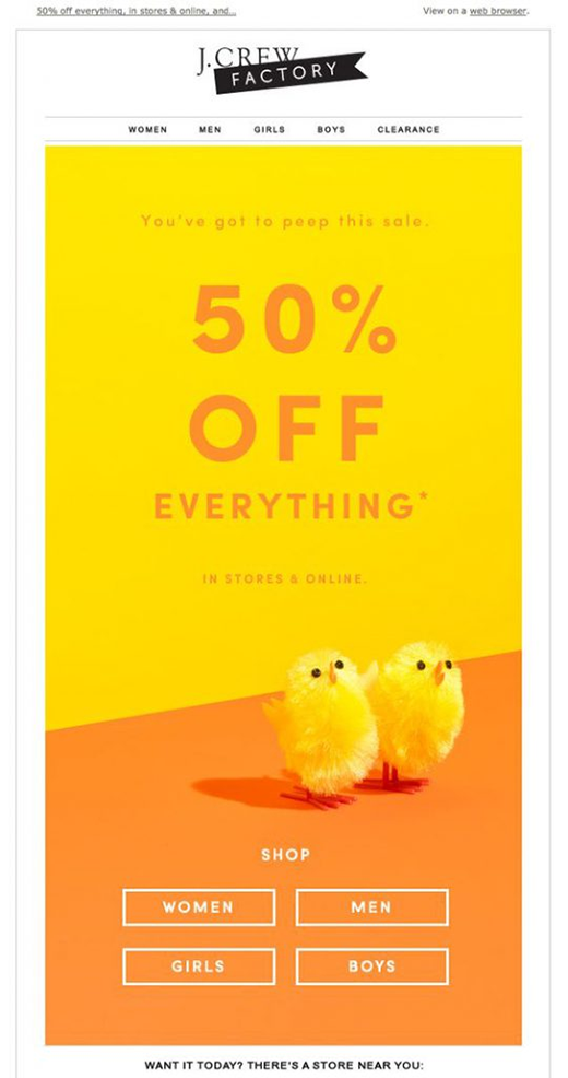
? NetHunt Pro Tip: Yellow is perfect for creating a friendly atmosphere in your emails. However, bright yellow can be considered as a childish colour, so be careful when using it to promote luxury goods.
Orange

Associated with: Impulsiveness
Orange is a fun colour. There isn’t much else to say about it, really. It’s a transition colour between yellow and red, so it combines the features these two have. It is equally as friendly and warm as yellow, and at the same time, it creates a sense of urgency.
Orange is the perfect attention-grabber. It can draw the attention of recipients to all the right parts, urging them to take action. Orange might not be the new black, but it has every chance of becoming the new red! It’s an incredibly enthusiastic colour, so a lot of marketers use orange as an alternative to red coloured CTAs.
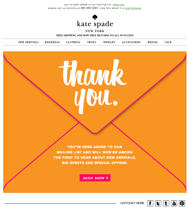
? NetHunt Pro Tip: Use orange to cross-sell or upsell, because it’s often associated with affordability.
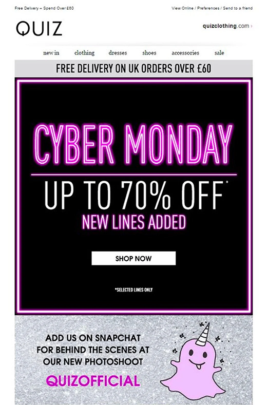
Red
Associated with: Passion and urgency
Red is by far the most difficult colour to interpret. It has a heap of different interpretations depending on your mental state, your background, and cultural upbringing. On one hand, it’s the colour of love, passion, and power. On the other hand, it’s the colour of danger and blood.
One way or another it’s an aggressive, actionable colour that can’t go left unnoticed. Even the tamest shades are loud and assertive.
According to a study conducted by HubSpot, the use of red increases conversion by 21%. That’s why it’s one of the most popular colours to use for CTA buttons and to highlight the important bits of emails.
Still, if your entire email is a combination of maroon, crimson, and hot red... nothing stands out, and you risk causing a crippling migraine.
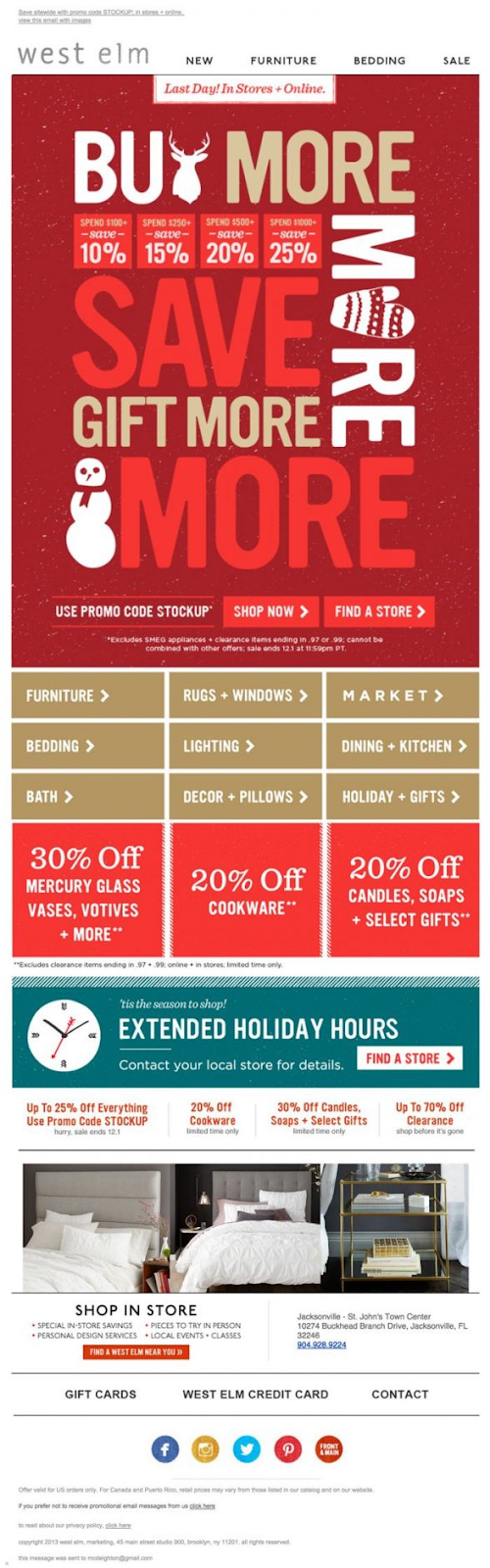
? NetHunt Pro Tip: Red stimulates people to make quick, impulsive decisions.
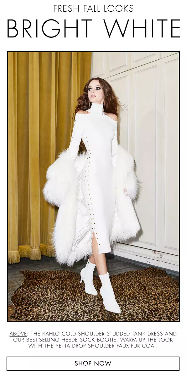
White

Associated with: Independence, simplicity, and purity
White is traditionally a bright and light colour. It almost never has dark, negative connotations and is only associated with positive things - purity, innocence, independence, and freedom. It is a very minimalistic colour that is often used by high-tech companies to highlight the prevalence of substance over form.
However, despite all the nice attributes of white, it’s hardly a statement colour. You can’t exactly use it to draw attention to the important parts of your email. Most often, it’s used as a background colour to declutter an email.
? NetHunt Pro Tip: Add other colours as white alone can often come across as cold and unimaginative.
How to incorporate colours into emails
The absolute minimum amount of common sense is enough to know which parts of your email can be customised to add some colour into your email copies. The background, the text, the CTA buttons, the images, the footer, and the header are the norm. But you need to go beyond the ‘norm’, ‘colour applicable’ email elements, and add a creative touch to your campaign and make it stand out among the ones your competitors send!
Top 3 creative ways to add colour to emails
- Add some colour to the emails’ ALT text
It’s already a known fact that you absolutely must add ALT text to your pictures. Some users choose to disable automatic image loading, some don’t even have the option to view them because their email client blocks pictures for them. One way or another, you shouldn’t put all your trust into them/ Instead, you should code the desired colours into the ALT text boxes. That way, even if the images fail to load, the reader will still get at least half the effects an image would cause.
- Use colours as dividers
You can organise the body of your email and make it more readable if you separate it with different colours. It’s a very subtle, unobtrusive way of highlighting the parts you really want your email recipients to pay attention to, as well as the ones they can skim without losing the gist of the email. - Experiment with the colour of links
Have you ever wondered why hyperlinks are usually bright blue? The colours green and red are the ones people with visual impairments most commonly can’t see; almost no one has a blue deficiency. This means almost everyone can distinguish blue as a separate colour.
Nevertheless, it doesn’t mean you can’t go crazy and change the colour of hyperlinks to be more in line with the rest of your colour scheme. It definitely stands out from the usual, making a difference in the minds of your email recipients!
Check our Pinterest board for more colourful emails!
Choosing a colour combination
You know which colours your email campaign benefits the most from. You know where to incorporate those colours into emails for them to make a difference. What you don’t know is how to combine all those colours together so that they don’t result in a hideous mess.
There are several solutions to this problem.
Approach #1 - The Fashionista Way
If your brand is big on following trends, you can exploit it in the process of choosing the right colour combinations for your emails.
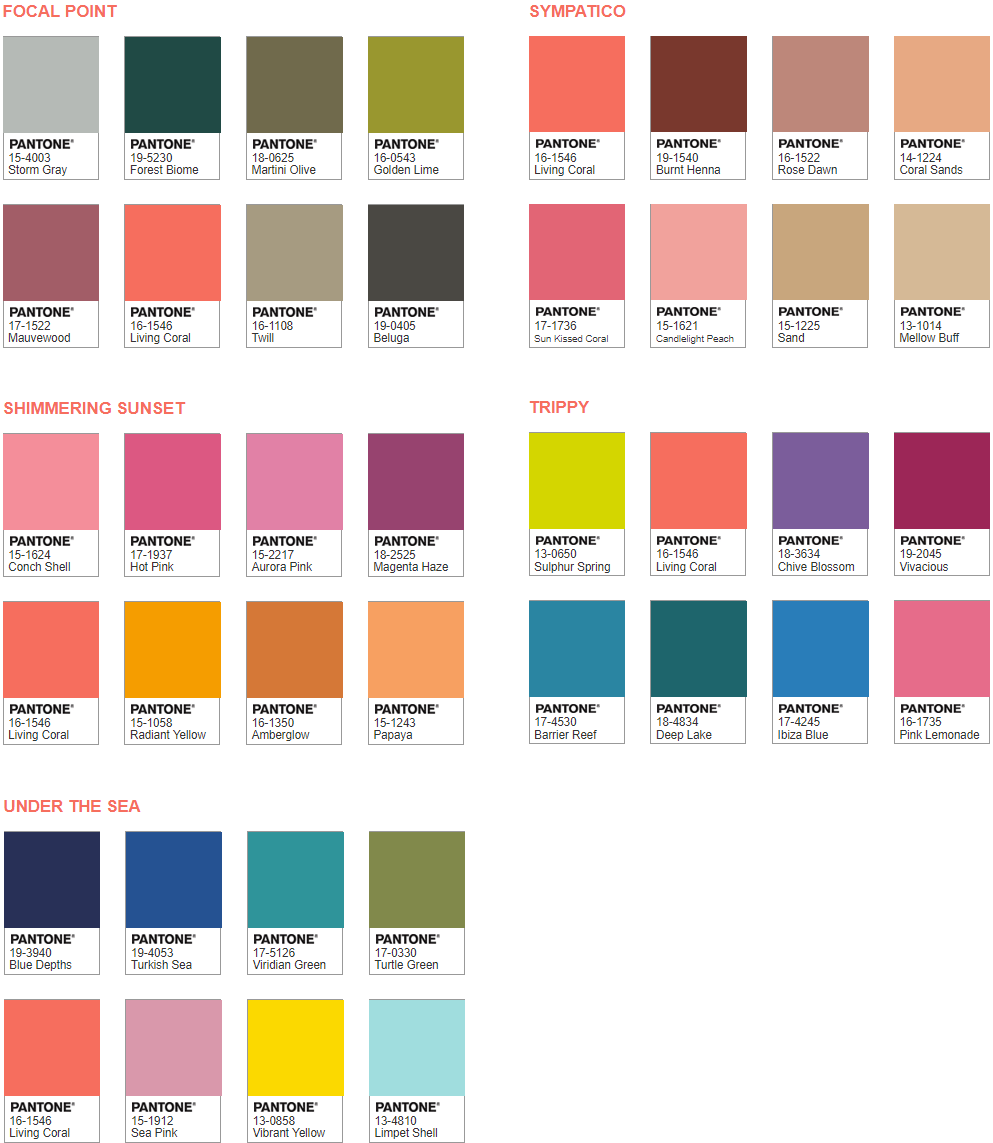
Every year, Pantone - aka the ‘Global Authority on Colour’ - spends month after month trying to decide the colour that best represents the year. Usually, they come up with a colour that best reflects the current cultural and political events taking place in the world.
There’s only one Colour of the Year award. However, in the process of selecting it, the Academy develops Pantone Year colour palettes that work great with each other. They are a big deal in the designer community. The colours are trendy, recognisable, and they most definitely compliment each other.
If you want to make a Pantone-approved statement, pick a year for inspiration.
Approach #2 - The Crowd-Pleaser Way
You don’t have to do all the hard work alone. Instead, you can kill two birds with one stone. Simplify your search for good colour schemes and appeal to the general public at the same time.
All you need to do is turn to an artsy community and look for a colour reference board. They’ll be more than ready to share. One of the most interesting colour palette archives on the web is Pretty Colours on Tumblr. This is a curated collection of people’s favourite colours that gets regularly updated with colour submissions.
Approach #3 - The Rebel Way
Sometimes, the wildest combinations produce the most prominent results. The nature of colour is strange. You can generate an absolutely stunning colour palette by combining contrasting colours; the sky’s the limit. You can experiment with different compositions of whatever you want, just make sure to get a second opinion on the results.For starters, you can try combining dark colours with bright ones, or go for opposite ends of the spectrum.
Approach #4 - The Safe Choice Way
Last but not least, you can go with the safe option. A good old combination that has already proven to be well-liked and is widely accepted by the common public. There’s no fun in it, but we don’t judge. A classic is a classic.
You can turn to nature for colour inspirations or analyse some other campaigns. Some of the most popular ‘safe’ colour combinations are:
- Watermelon (green and pink);
- Pastel blue and baby pink;
- Grapefruit (pink and orange);
- Lime and orange.
Dos and Don'ts of using colours in emails
✔️ DO make sure you understand the implications of the hue and shade of the colour you use
You still need to make sure you’re familiar with all the possible interpretations of the particular shade and hue of the colour you pick to use in the email copy.
Example. Dark red stands for range and courage; light red can mean happiness and love; pink is often used to represent femininity and romance; rusty red is there to account for change and fall.
❌ DON’T go overboard with colours
It’s difficult to stick to just one colour. You always want to add more to make it brighter, more memorable, and more colourful. That’s where you need to stop! Turns out, there’s a maximum number of colours you can incorporate into your email before it starts looking tacky. Three.
The general rule for using colours in emails is the 60:30:10 rule. 60% of your palette should be a single colour, 30% is a complementary colour, and 10% is an accent colour.
✔️ DO stick to your brand’s colour scheme
One of the key reasons to incorporate colour into your emails in the first place is to boost your brand awareness. If the colour palette you use in your email campaigns has absolutely nothing to do with brand colours, the recipients of your emails have a hard time connecting the emails with your business.
No matter how far you go away from your regular brand colours, always make sure to add some links to them.
❌ DON’T forget to check whether the codes for your colours are correct
Once you’re done with planning out your email’s colours and are getting down to coding, you need to make sure that everything goes as planned. To do that, you should stick to the HEX triplet, or its shortened three-digit form instead of incorporating an RGB one. Some email clients fail to display the latter properly, and you might end up with broken colour.
Example. Go for #16b8f3 instead of RGB(30, 180, 233) if you want Zima Blue to be true to colour.
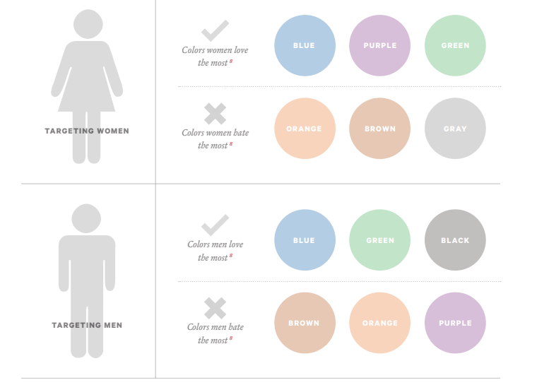
✔️ DO make sure you know your target audience’s colour preferences
You need to remember that even though colours can be described through the laws of physics and mathematics, they are incredibly subjective. The success of your email marketing campaign depends on how your target audience perceives the colours you use.
You need to account for the demographics of the subscribers of your mailing list.
❌ DON’T risk getting sent straight to the spam folder by choosing colours that are too bright
Sometimes, it’s better to stay lowkey. While we don’t want to limit your creativity, here’s just a gentle reminder about the SPAM mechanism most email clients use. The higher the concentration of bright colours in an email, the higher are its chances are of being sent to the spam folder.
✔️ DO A/B testing your colour combinations
You need to remember that regardless of how much you and your team love the finished product, you are not the ones to judge. To get a full understanding of whether you’ve mastered colours or not, you need to conduct A/B testing. It’ll help you see which colour solutions work best for your audience.
Once you’re done with perfecting your colour choices, you can get to the next step of crafting a perfect email campaign - creating a beautiful email template!

 product experts — let's find the best setup for your team