


Unless you were a raging nerd back in school, you should understand the utter dislike I used to have for tests of all kinds. Tests are stressful, require a lot of preparation, and have no real value because they aren’t accurate enough to assess knowledge without being biased. Tests suck.
Well… At least that’s what I used to think about tests.
Now though… everything has changed.
As an adult who works in Marketing, I quite like tests. They save a lot of time and money, both of which you start appreciating a bit more once you grow older. A good test can boost your business performance and aid growth! Don’t believe me?
President Obama got $60 million for his funding campaign thanks to A/B testing...
[Event360]
… so, why wouldn’t you?!
In this article, you'll learn:
What is A/B testing?
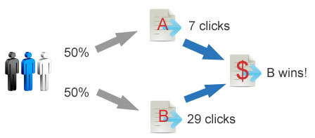
A/B testing is the process of comparing the performance of two versions of the same web page, email copy, web form or any other marketing asset to assess which one drives better conversion.
Example. You’ve read an article about the power of colour in email marketing and are excited to leverage your newly acquired knowledge. You’re aware that people are more likely to feel the urge to buy at the sight of the colour orange, you want to change the colour of a CTA button in your promotional emails to it.
You hypothesise that the use of orange in your next email marketing campaign will lead to an increase in your conversion rate. But before you commit to changing your CTA button colour, you need to make sure that your mailing list subscribers aren’t an exception to the rule. After all, everyone is different, and what works for other businesses might not be the best fit for you and your audience.
To be sure your hypothesis is correct, you need to test it first. You send out two versions of the same email to two different groups of subscribers. The first version is your regular, old email, and the second one is an orange variation on it.
Afterwards, you see how each email performs using email tracking, such as bounce rates, clicks or conversions.
The best thing about A/B testing is that it doesn't limit how big or small the single changes you’re testing can be. It allows you to dissect your marketing assets and better understand how each little detail affects the overall performance. This makes A/B testing one of the most effective conversion rate optimisation (CRO) techniques.
Split testing is a term people compare to A/B testing. This isn’t quite right. The two terms aren’t interchangeable as there’s a difference between them. A/B testing refers to comparing two versions of your marketing asset upon changing one element, such as the colour of the CTA button, the subject line, etc. On the other hand, split testing involves comparing two distinct designs.
Both types of testing are valid but serve a slightly different purpose. While split testing allows you to get a general direction of what your audience likes, A/B testing is significantly more precise in its findings. It gives you a chance to get a gist of how particular variables affect the outcome, and which exact elements contribute to differences in data.
Speaking of terminology… Every A/B test comprises three key components:
- Variant. A variant refers to every new version of your marketing asset that you put to an A/B test. The minimum number of variants your A/B test should have is two, while the maximum number doesn’t exist.
- Champion. Whenever you put two or more variants to the test, only one will win. The variant with the best performance is crowned the champion variant.
- Challenger. Whenever you put the champion variant to the test, you create a new version to compare its performance against it. This is the challenger.
Why should you start A/B testing?
I’m not going to sugarcoat it. A/B testing isn’t the most straightforward conversion optimisation method. Quite the contrary, it’s associated with an array of various challenges a marketer can change before they identify the champion variant. Nonetheless, despite all the challenges related to A/B testing, marketers still use it to achieve their goals.
“97.6% of businesses claim to run A/B tests; 71% of companies run two or more A/B tests per month.” [Invesp]
And that’s because A/B Testing provides a bunch of benefits...
- It allows you to make incremental changes without jeopardising current conversion rates.
Changes are a critical part of economic growth. You can’t move forward if you’re not advancing your marketing assets. However, it’s down to you to decide whether you want to risk it all and introduce some radical changes or implement them step-by-step in a more gradual manner. A/B testing allows you to assess the effectiveness of new elements systematically. That way, you maintain your conversion rates at a steady level as you can promptly revert any changes that turn out to be less effective. - It’s useful in low data-rate testing.
For a statistically significant result, you need to have a certain amount of input data. A lot of marketers claim that the smallest viable number of trials that can produce an unbiased result is 25,000. Although it’s no biggie if you don’t. Even if you’ve just launched a website and can’t boast an awful lot of traffic or conversions, or you only have a small number of mailing list subscribers (learn how to grow it here!), it’s still possible to conduct A/B testing. You’ll always be able to determine which variant performs better reasonably quickly. - It simplifies analysis.
A/B testing uses clear, straightforward metrics that are easy to analyse. A/B testing provides an objective way of determining a ‘winner’ and ‘loser’, based on real, factual results.
- It helps reduce bounce rates.
It can be devastating to spend hours perfecting your website and filling it with content only to realise your visitors don’t stay for long enough to explore it. A/B testing different feature images, fonts, colours, and blog post introductions can help you find the right combination to reduce bounce rate and retain more visitors. - It increases conversion rates.
There are millions of little different details that can affect the effectiveness of your CTA. A different shape, colour, or font of your CTA button can have a massive impact on the number of leads clicking it. A/B testing helps identify the optimal look of these elements, maximising the number of visitors who submit their info to you. - It decreases cart abandonment.
According to Mighty Call, around 40% to 75% of customers leave their shopping carts without completing the checkout process. A/B testing checkout page components, as well as product descriptions and photos, can help reduce cart abandonment.
What can you A/B test?
In theory, you can put almost any element of your marketing assets to the test: subject lines of email marketing copies, web forms, design and outlay of your landing page, and CTA text. They all contribute to the volume of sales you generate at the end of the day.
In reality, you can rarely test every single one of these components. The range of attributes you A/B test depends on the number of resources available to you. With a limited budget, you might want to slow down and start by testing elements that make the most impact.
Once you’re done with the following marketing components, you can move onto bigger things. Or to be more precise… smaller details.
? NetHunt Pro Tip: Ensure you’re choosing actionable metrics to analyse the results of A/B testing. While every component can be measured using the same approach, the accuracy of results is significantly lower than when using element-specific metrics.
Text
Almost every marketing asset - be it email copy, a CTA button, or a blog post - has some form of text incorporated into it. It’s text, in particular, that crowns the list of the elements that need A/B testing.
Here are a few critical text-related components that you can experiment with for improved conversion rates.
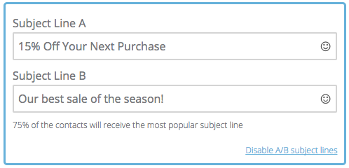
- Email subject lines.
There are numerous variations of the subject lines you can use. A lot of the time, the wording of a subject line depends on the goal an email marketing campaign is trying to achieve. Still, the purpose of crafting the most compelling email subject line is always the same - to get your emails opened. The metric you’ll be using to A/B test your subject lines is the open rates of your emails. Do this by tracking your emails.
- Text body.
No matter what marketing asset we’re talking about, there’s a 90% chance it’ll contain text. Often, it’s the text body that’s capable of making the most impact. The biggest pet peeve with text is the length. Generally, customers prefer shorter copies that go straight to the point.
For instance, emails between 50 and 125 words long show the best response rates of over 50%. Sometimes a longer, more detailed copy is needed to drive a purchasing decision. A/B testing text helps to know for sure. The metrics you’re looking for here are the response rate, and the time spent on a website (if talking about blog entries).
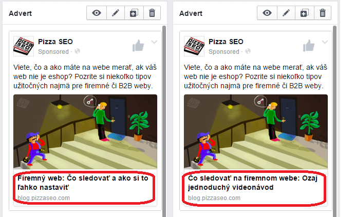
- Headlines and subheadings.
Headlines are one of the quintessential reasons users click on the article. They need to be short, engaging, and catchy. Finding the right headline format - the one that is engaging and intriguing - requires a lot of testing. In addition to the headlines, you also need to sort out your subheadings. The way you organise your writing influences its readability and, therefore, user engagement rates.
- Product descriptions.
A product description is as close as a piece of writing can get to closing the deal. While promotional texts and blog posts are essential in the early stages of a sales funnel, once a lead is ready to take action and make a purchase, it’s the product description that can make or break the deal.
You need to compose a perfect product description that is both promotional and informative. Even more importantly, you need to find the ideal balance between the two that prompts people to buy the product. The defining metric for testing product descriptions is the number of adds to the shopping cart and subsequently, the number of purchases made. - Text body formatting.
When you speak, you use different intonations of your voice to deliver different messages. In writing, the different intonations are represented in another format. Highlighting pieces of text, underlining specific words, putting them in italics or bold all have a unique effect on the reader of your message. Moreover, the choice of font is proven to be essential for the effectiveness of a text. According to a study conducted by the Software Usability Research Laboratory at Wichita State University, texts in Times New Roman and Arial are read the fastest, while texts in Arial and Courier are the easiest to understand and, therefore, are the most actionable.
- Writing style.
Unless you’re a well-established brand that’s best known for its unmatched writing style, it’s recommended you regularly experiment with the way you deliver your message. Some audiences prefer to receive information in a casual, relaxed manner, while others are more interested in academic writing. Finding your style is trial and error. A/B testing will make the error part a bit more subtle, and the trial more effective.
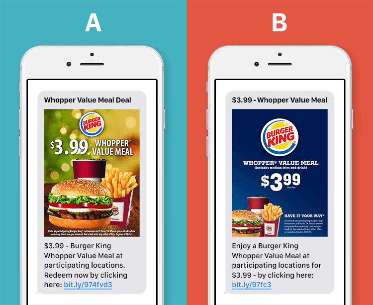
Images
I’ll never get tired of saying an image is worth a thousand words. Once you’ve perfected your text, it’s time to move onto bigger things - adjusting images.
You must have heard about all those Aliexpress expectations vs reality memes. Even though online shopping is now the norm, a lot of people are still wary of buying things online because of unfortunate mishaps associated with the process. Indeed, it’s always a shame to purchase an item you’ve wanted for a while only to realise it’s nothing like you imagined it to be once it arrives.
For this very reason, you should fill your website with pictures that sell. You must optimise your product pictures to drive the highest levels of conversion. The only way to find the right ones is by putting all your options to the test.
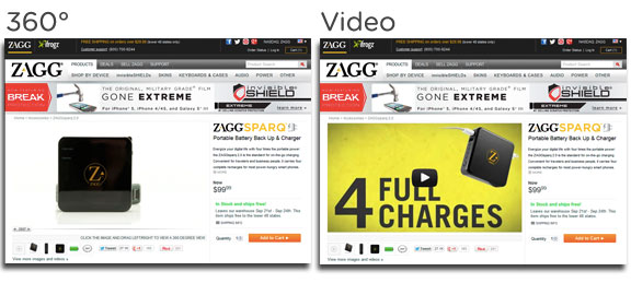
? NetHunt Pro Tip: To boost the number of ‘add-to-cart’s, present a 360-degree view of the products you sell. According to the experiment conducted by Zagg, a 360° product image is capable of increasing the average order value by 10.4% compared to a static image or a video.
It isn’t just marketplaces that can benefit from the imagery they use. All types of businesses can improve their online performance by adjusting images in line with their visitors’ preferences.
It’s imperative to A/B test images because it is the most subjective element. While you can use the theoretical framework to come up with a hypothesis about which shapes and colours have the most positive impact on your visitors, you can’t possibly ensure your prediction is accurate.
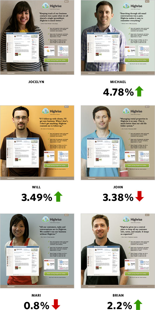
Example. When Highrise A/B tested the appearance of their landing page by changing the pictures of people in the background, they’ve received some surprising changes in conversion rates.
Design and layout
Too often, businesses think that everything they do is equally important and worthy of attention, trying to pack too much information into their website pages or emails. They should know that less is more.
To increase visibility and actionability of each element of your design, you need to declutter your space and make the essential things pop. One way of identifying the vital features to keep is to A/B test different variations.
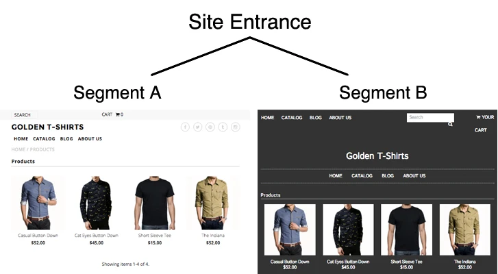
On top of that, you can also benefit from testing different colour schemes and playing around with the outlay of your page. Sometimes, all it takes for a conversion to occur is for the key offers’ location to match the eye-movement path of the lead.
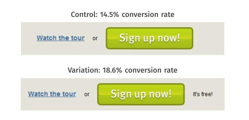
CTAs
Every piece of writing you include in your marketing copies- be it an email or a blog post- needs to conclude with a clear and actionable CTA. The Call-To-Action is by far the most crucial part of your marketing asset. It explains what you expect your leads to do by encouraging them to take that action.
The success of your CTA is the subject of consideration. Its effectiveness depends on an array of factors such as size, wording, location, and colour scheme. Even the smallest alterations can increase conversion rate!
‘CTA buttons are the most tested website elements.’ [eConsultancy]
Forms
One of the biggest problems with forms is that they’re often left ignored. There are several reasons why that could be the case:
- Too many fields.
- Unappealing colours.
- A weak CTA button.
- Wrong positioning on the site.
It’s essential to sort your little webform problem out because they are crucial for building a sturdy mailing list. Optimise your forms to get the most number of data input by A/B testing them.
? NetHunt Pro Tip: If you want more people to fill out your form, make sure to include a picture of a person looking at it. It subconsciously draws attention to the form and sparks interest in the visitor.
Social proof
User-generated content is one of the hottest marketing trends for 2021. Naturally, you want to include a couple of testimonials from your customers to increase brand credibility. The way you present your social proof can vary. An embedded tweet with a mention of your products or your company in general, a photo and a quote, a user review section can all serve as social proof. Your job is to determine which one has the most positive impact on your target audience and comes off as the most convincing for them to make a purchase.
Although this article didn’t cover absolutely everything you can A/B test (the blog would simply get too long for you to keep reading with enjoyment, we’ve already tested it), it’s a good selection of the elements to start with.
Remember, perfection is the enemy of progress, so as long as there’s something else left for you to A/B test, you’re good to go!

 product experts — let's find the best setup for your team